Butter
Cannabis
Packaging That Melts Into The Brand
Creative Direction
Packaging
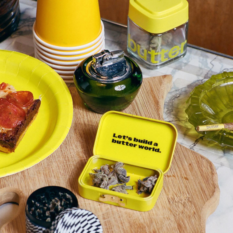
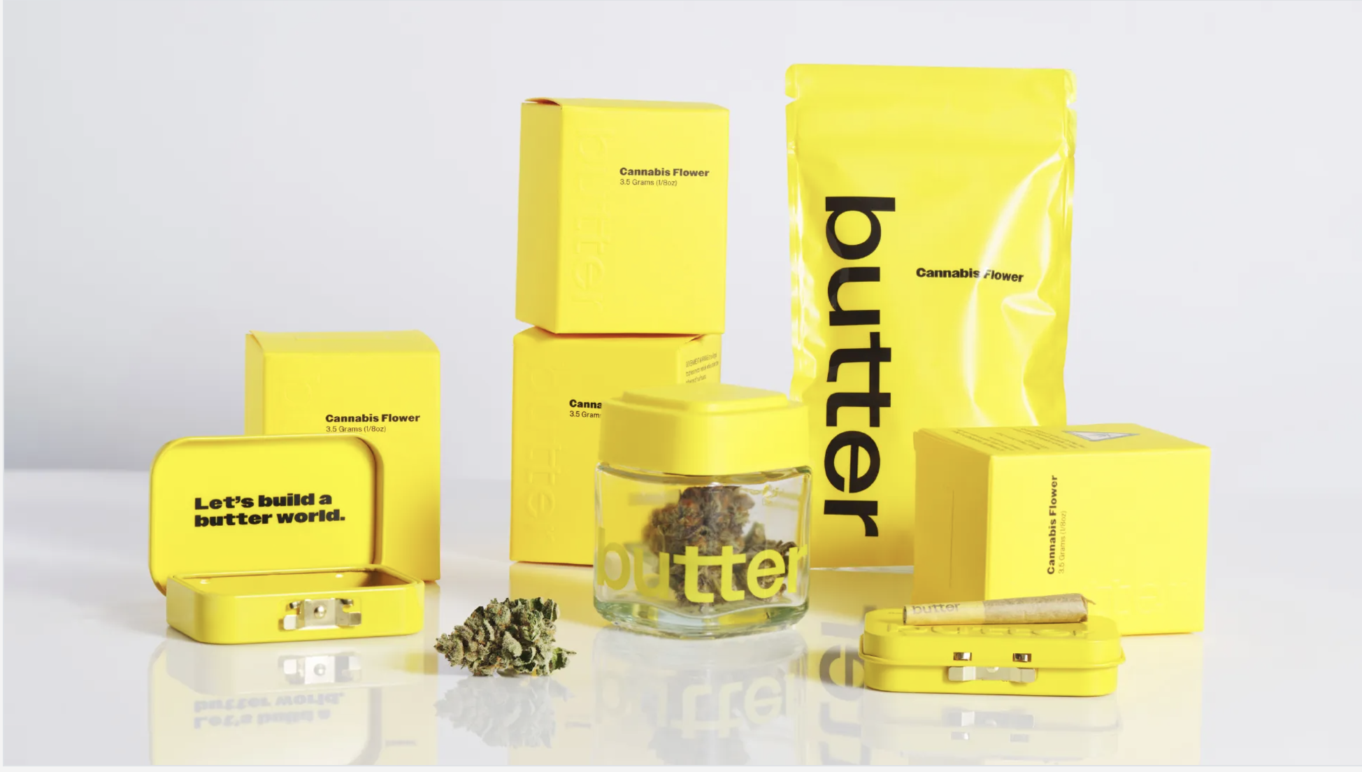
When Butter + Center Design came to Calyx Containers, they had a bold vision: their cannabis brand needed packaging that didn’t just say butter, it needed to feel like butter. For such a smooth and satisfying brand, the packaging had to deliver on that same promise. As Creative Director at Calyx, it was my job to lead the team and make that vision a reality.
Through collaboration, countless rounds of prototyping, and innovative outer packaging solutions, we crafted a design that not only looked the part (sticks of butter anyone?) but also complied with the strict regulations of the cannabis industry. The final product seamlessly blended creativity and functionality, bringing Butter’s identity to life.
The result?
Packaging as attractive as the product inside. It really is as smooth as butter.
butter
CENTER Design
Calyx Containers: David Leung, Manny Cordiero, & Ruby Rose


